MinkAI
UX/UI and web design

Project Overview
One of the projects I had as my position of Lead Digital Designer in Bitzone is making an applicant tracking system (ATS) for technical positions in South America. Our CEO, Luigui Astohuamán, wanted us to create an MVP to to offer it as a B2B SaaS to stakeholders and potential companies that might be interested in purchasing it. MinkAI would be our company´s first digital product, as Bitzone normally offers custom software solutions to clients.
The problem
There are several recruiting search engines for the Latin American market but not enough AI recruiting systems focused on technical workers and operators in medium to large companies for the South American region. Recruiting in these countries tends to be very bureaucratic, tedious and complex. Both applicants and recruiters have a hard time on achieving their goals. From Bitzone, we wanted to offer a solution through an accessible recruiting tool that can be highly appreciated for both the recruiting companies and their applicants, making their process easier, shorter and with almost no paperwork.
We are making an MVP in a very short time for our first presentation to clients so the time we had available is limited and we are expected to design MinkAI in a few weeks.

The solution process
For this project we me and two junior designers (the design team) worked very closely with the development team (Front and Back end), as we were developing the app through an agile methodology and needed the MVP to be designed and developed fast. The product's working name was HumanTech and we later changed it to MinkAI as the project progressed.
Product research
We managed to contact competitors themselves to ask about their particular products and how do they operate on their regions. In our case, we were more interested to make a ATS specialised on the South American market, to address particular problems and needs that the other ATS providers do not, as they are focused more in the general Latin American region and for all kind of jobs, not specifically technical nor short-term jobs. Nevertheless, we obtained important information regarding information architecture and user flows.
In parallel, we worked on several moodboards in Miro regarding wireframe style, visual identity, and similar apps. Our lead developer, Rodolfo, wanted us to work from references first, to make a first version that we could later test through iteration. Through our collection of ideas regarding both UX and UI we identified several characteristics regarding recruiting search engines and recruiting AI analytical tools. Our team wanted to incorporate different characteristics of both types of products.


Organization
We had to be able to focus on deliverables across teams on an agile and effective way so our project lead and AI expert managed a kanban board in Trello. Here we monitored all tasks and had our meetings twice a week through our main Discord channel. We also made an effort/effect matrix to estimate the development risk and cost in time.
Personas
We did some 1-to-1 interviews with recruiters and applicants to be able to define our users, their JTBD, tasks and needs, and therefore validate and improve our understanding of our users.

Customer journeys
To understand better the type of product we were trying to develop, we did a customer journey for the recruiter user and the applicant user. It was important to understand the motivations of our users from a starting point, that we would validate later when testing the MVP.

Applicant user

Recruiter user
Brand and visual identity
After exploring the different possibilities for this kind of product and the users' initial priorities and expectations, we agreed on that the brand design should have a minimalist look and feel, work on its linear and ethereal appearance and possess a name that represented local identity.
For the naming, we explored words in Quechua and Aymara, two Peruvian native languages, related to concepts on work, contract, encounter, place of work and crossroads. We wanted a brand that spoke about a meeting place between an applicant and a recruiter, our two users.
We selected Minkay ('to hire' in Quechua), Tupay (encounter in Quechua) and Pallqa ('crossroads' in Aymara). In our meeting with the development team and our CEO, they chose Minkay for its meaning and aesthetic. They also opted to change its last letter to 'i', so it read MinkAI, highlighting on the brand the element of artificial intelligence in the product.
For the logo design, we proposed 3 colour schemes but in the end everyone agreed light blue was the most appropriate to give a look and feel of calmness and organisation.
The isotype chosen was a circle with small arrows pointing to a centre point, indicating convergence of paths, symbolising a button and representing geometric shapes from our ethnic local tradition.


User flows
Together with the developer team, we built the initial user flows for the Recruiter user and the Applicant user. After several iterations and feedback from other teams, we used this as a backbone for our wireframing.

Wireframing
We did then lo-fi wireframing according to the development teams notes, following closely their flow diagram. We had initially a landing page, login and signup windows and then two homes, each for a different user: recruiter and applicant. The landing page has a login option to access each type of profile and their funcionalities.


Lo-fi wireframe

Hi-fi wireframe
We then picked a wireframe and did its UI according to the brand we were designing, to serve as an example for the rest of hi-fi wireframing process.
Product's UI and presentation
For this stage I worked on my own as the other designers had to attend another project. I made some UX corrections after talking to the Front-end developer and our Lead Developer, created and additional Menu for the Job positions and made other improvements both in UX and UI.
We ended having 21 wireframes and, depending on the iterations that are to come, this number may change. For the time being, it has passed to the development team for coding to have our first version of the MVP.
Additionally, I prepared a Pitch Presentation for out CEO and Project Manager so they could present our MVP to stakeholders and initiate the pilot testing with selected companies.


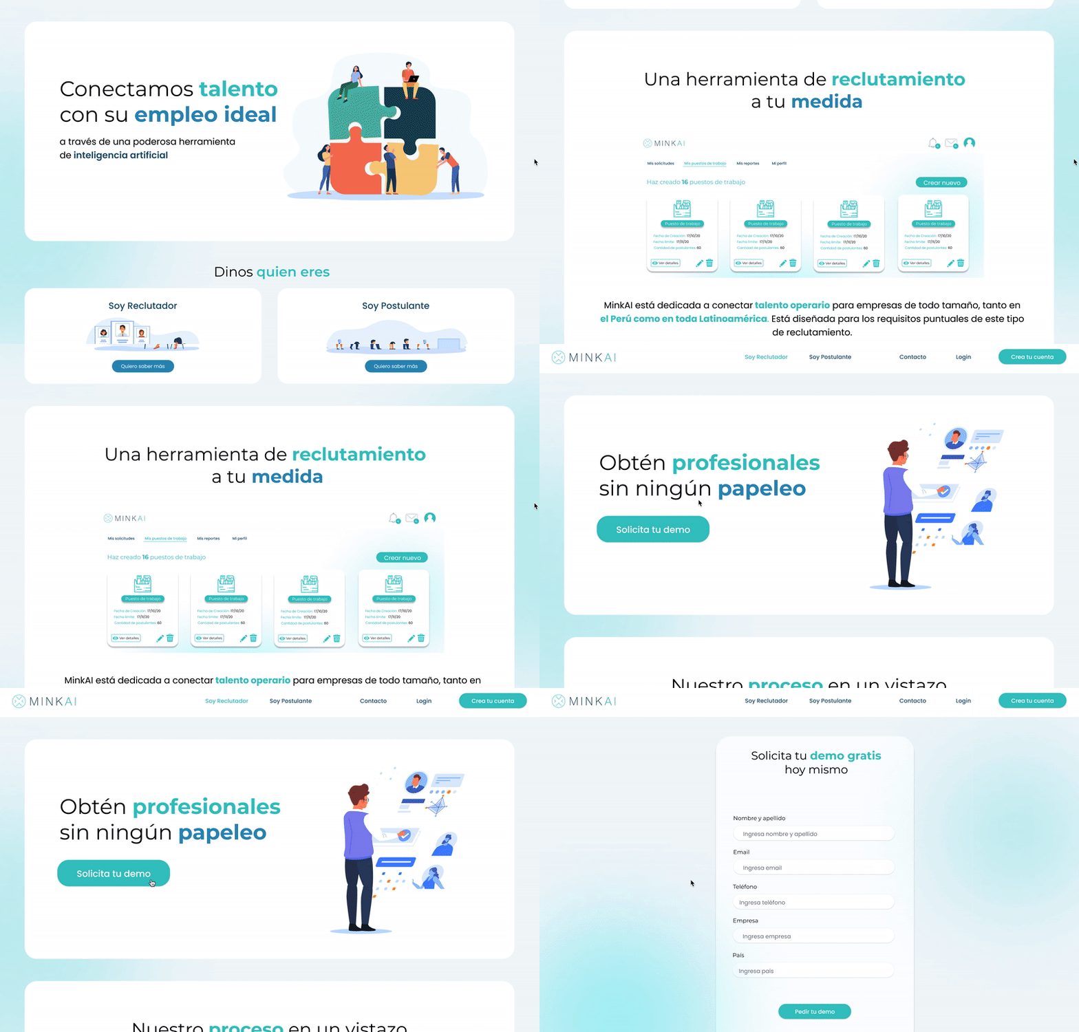
Landing page and register for Recruiter user
Slides for the Pitch Presentation

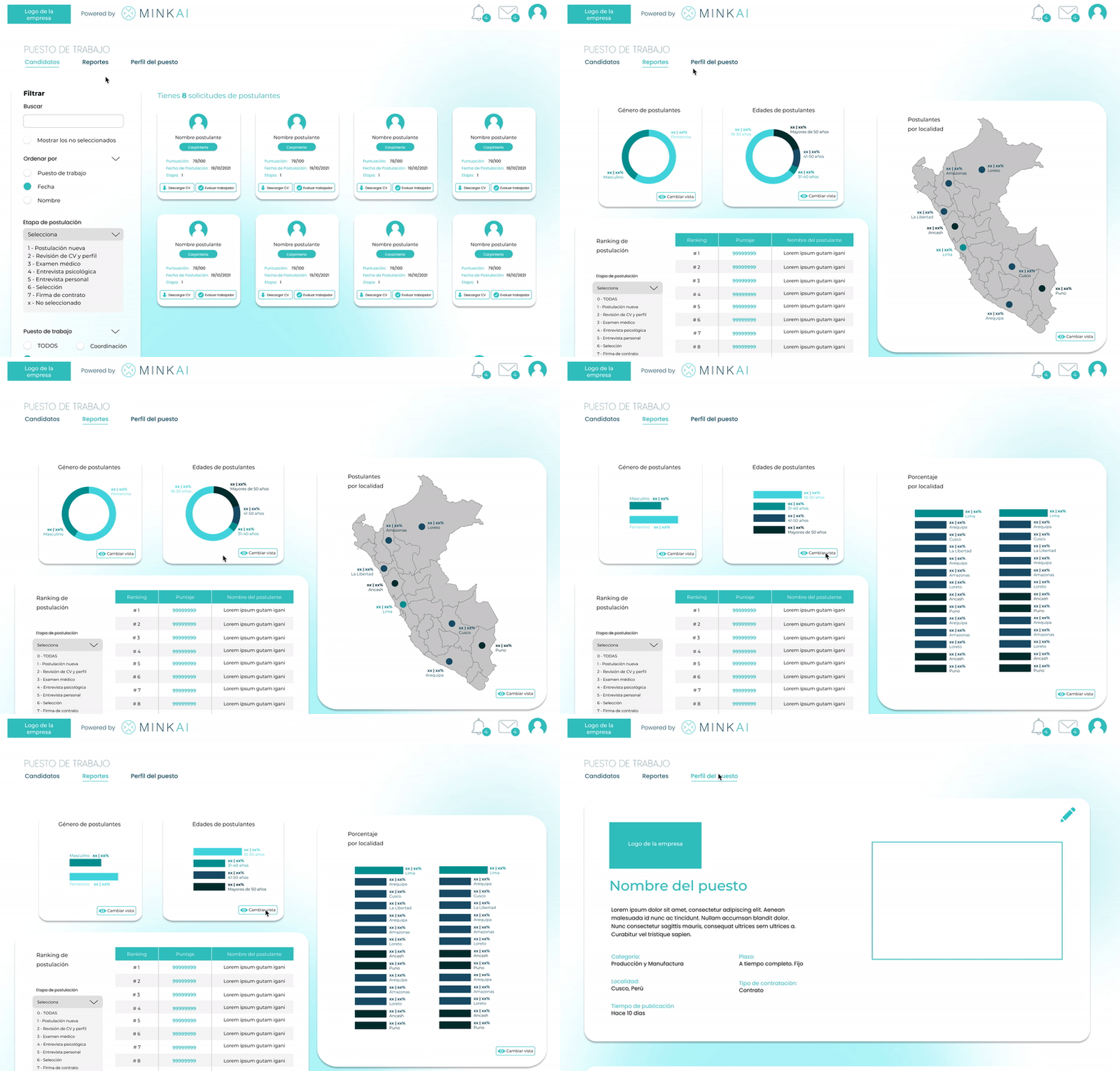
Recruiter profile: Candidate, Repots and Position's profile views
What did I learn
I have learned plenty by working on a more complex UX/UI project related to AI. Mainly it has been a very enriching experience work with other UX/UI designers, as I usually work on my own. I have learned how to manage tasks and delegate different parts of the project, bearing in mind that this is one of the many projects we are working in the company. It is sometimes complicated when we are working on several projects but I am learning to plan better and focus my energy and skill in a more efficient way.
Constraints and limitations of the project
This project had a time constraint but allowed me to work effectively with the design and development teams. For us, it is the first time we are developing a recruiting tool and we really wanted more time to do more throughout user research.
Nevertheless, we will be able to proceed with this in the following months, when we get to pitch and show this project to stakeholders and potential clients. Another limitation is that Bitzone's work is fully remote, which makes it sometimes hard to connect with colleagues and be on the same page when working together through different timezones.

Applicant profile: Search, Applications and My profile views

